As many of you are aware, Facebook has completely changed their look, feel, and functionality. And we have to comply by the end of March.
For many businesses that developed a welcome page, including us as an Internet marketing firm, to maximize the number of visitors that “Like” us and opt-in as a lead, we now have to shift to a new strategy. The question is, how do you use Facebook now, from an Internet marketing perspective?
In this post, we’re going to show you how it’s done and provide some examples of companies that have already approached this correctly.
Before we get started, for those of you who are not aware of this change, you may want to check out this quick video from Facebook.
It provides a quick overview of the new look and feel. If you’re ready to make the transition, here’s a quick guide of the key areas to focus on to drive results from a business perspective.
The first area that you want to work on is your cover photo. It’s 851 x 315 pixels. Facebook has imposed some serious guidelines that you have to follow, whereby you can’t include:
– Price or purchase information, such as buy now, or 25% off.
– Contact information
– References to Like and Share
– Calls to action
With that said, the cover photo is a great opportunity to position your company and reinforce your brand.
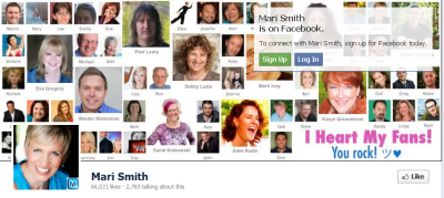
In this example, Mari Smith, has done a great job of positioning herself as a Facebook expert, while coming across as someone who is approachable and likeable.

The next thing that you want to do is to set up your profile picture. You want your profile picture to work off of your cover photo. Red Bull’s done a great job, as a larger company, of integrating their logo with the positioning of giving you flight and wings as you can see here.

The next step is to organize your views and applications, which is the section below the cover image. The key here is that you want to appeal to different types of prospects that are at different stages in the decision making process.
For those who are simply information gathering, we’d recommend including a free download option and events if you have them, such as webinars. For prospects that are at a more mature stage in the buying process, we’d recommend including success stories and case studies.
The key is that you want your applications to appeal to people at different stages. A company that has done a great job of this is HubSpot. As you can see in this example, you can view case studies, opt-in, or attend an event. It’s a well-balanced solution.

Facebook now allows you to pin or anchor a story as your feature story. This is a huge opportunity to maximize conversions and opt-ins. We always recommend the importance of building a complete marketing campaign. Here’s a great opportunity to do just that. We recommend providing some exceptional value in this feature story with a call to action to learn more by opting in.
You can also use the timeline feature to tell your personal and company stories. Mini has done a fantastic job. What I love about this feature is that you can now tell your story and start building a relationship with your prospect. You can show them how you developed as a company over time to be where you are today. The fact is that people buy from people, and this is a great way to show your personality.
If you have any questions, please leave a comment and look out for our new Facebook design coming soon!
