First let me start by saying that these aren’t my tips, but ones found in different places and use. Most of them come from two books on Web Design by SimpleBits, Bulletproof Web Design and Handcrafted CSS, they are a wealth of knowledge and from them I have worked out some tips that really helped me :

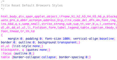
Resetting Styles : This will help you zero out the default styles some browsers set. By setting the margin and padding to zero on html, body or divs you don’t have to have “margin:0;” in the style. And when you want to change the margin, anything you put in will cancel out the margin zero. You can have a separate Style Sheet for this but, you can also put it at the top of your main style sheet to help with “Page Speed” which I have talked out before.
Work With Ems : Using Ems as your unit of measurement will make your page fluid and flexible. The trick to this is to set the font-size of the “body” to 62.5% , which will change the base size from 16 px to 10 px, now if you want the width of a “div” to be “500 px” you set it to “50 em”. And now the page will be fluid if some one zooms in or out. This works for every style rule , so if you want to have a margin of 10 px you set to 1 em. You think in pixels but work in ems.

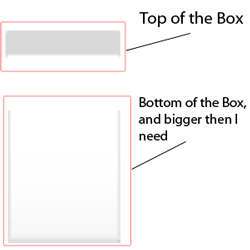
Use Repeated Backgrounds and Expanding Boxes : Using a background that is 1 pixel wide that repeats across your “body” element or div will cut down on load times and allow the back ground to be flexible. And Breaking apart boxes that have backgrounds into a top and bottom piece and using a bottom background that is bigger then you need at the moment will allow it to expand if the Website visitor set the font to Larger, or if you need to add content to the box. This will also work with left to right items as well, you just have to think of how your boxes need to flex.

Putting your Margins and Padding on One Line : When I look around the Web I see people putting “margin-top:10px; margin-right:20px ; margin-bottom: 5px; margin-left: 5px;” it would save 3 lines of code in your style sheet if you use “margin: 10px 20px 5px 5px;” this also goes for padding and when working with background or borders.
Cutting down the code is best for so many reason, including when you have to do changes , also for SEO as it makes the page faster and flexible to all users.
